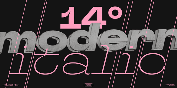
The world of fonts is constantly evolving, with new styles emerging to capture the zeitgeist. But in the ever-changing landscape, what defines a “modern font”? It goes beyond fads and fleeting trends. Modern fonts are a dynamic force in design, pushing boundaries while retaining a timeless quality that elevates communication and shapes user experience. Let’s delve into the essence of modern fonts, exploring their characteristics, strategic use, and how they can empower you to create truly impactful design experiences.
Beyond Novelty: Defining the Hallmarks of Modern Fonts
Modern fonts are not simply the latest releases. They embody a set of key characteristics that translate into visually compelling and functionally sound design solutions:
- Minimalism and Clean Lines: Modern fonts often embrace a minimalist aesthetic, favoring clean lines and uncluttered letterforms. This allows for clear communication and reduces visual clutter, particularly important in today’s information-dense world. Think of the sleek and simple geometric shapes of fonts like Proxima Nova, widely used for its clean lines and versatility.
- Focus on Functionality: Modern fonts prioritize user experience. They are designed with readability in mind, ensuring clarity across various screen sizes and platforms. This focus on functionality reflects the increased importance of digital communication and the need for fonts that perform well in diverse contexts.
- Dynamic Versatility: Modern fonts are not one-trick ponies. They offer a range of weights, styles, and optical variations, allowing for adaptability across diverse design projects. This versatility empowers designers to create a cohesive visual language while maintaining flexibility within the font family itself. Take the example of Open Sans, a modern font family offering a variety of weights and styles, from light and airy to bold and impactful.
- Subtle Experimentation: Modern fonts don’t shy away from pushing boundaries with subtle experimentation. This could involve unique letterform shapes, innovative spacing, or unexpected weight variations. However, these explorations are always balanced with readability and functionality, ensuring the font remains impactful and user-friendly.
The Power of Modern Fonts: Beyond Aesthetics
Modern fonts offer more than just a stylish upgrade to your design projects. They hold the power to:
- Enhance User Experience: Clear and readable fonts contribute to a positive user experience, especially on digital platforms. This is crucial for websites, apps, and other digital interfaces where clarity and ease of use are paramount.
- Evoke Emotions and Brand Identity: Modern fonts can be used strategically to convey specific emotions. A sleek sans-serif font like Avenir can project a sense of modernity and innovation, while a playful script font like Lobster might evoke a warm and friendly brand personality.
- Stand Out from the Crowd: In a crowded visual landscape, modern fonts can help your design project stand out. By utilizing unconventional letterforms or a dynamic weight combination, you can create a unique visual signature for your brand or project.
- Future-Proof Your Design: Modern fonts are designed with longevity in mind. Their clean lines and focus on functionality ensure they remain relevant and visually appealing for years to come.
Choosing the Right Modern Font: A Strategic Approach
Selecting the perfect modern font for your project requires a strategic approach that considers both function and aesthetics:
- Project Goals: What message are you aiming to convey? Is it an informative piece requiring clear communication or a marketing campaign seeking to create a bold statement? Choose a modern font that aligns with your overall project goals.
- Target Audience: Understanding your audience’s demographics and preferences is crucial. Choose a modern font that is visually appealing to them and resonates with the overall tone of your message. For instance, a tech startup targeting millennials might choose a futuristic typeface like Eurostile, while a children’s book publisher might opt for a playful display font like KG Pangolin.
- Readability is Paramount: Even the most visually striking modern font shouldn’t compromise clarity. Prioritize readability by ensuring the chosen font is clear at various sizes, especially for body text.
- Harmony and Cohesion: Consider how the chosen modern font will integrate with your overall design scheme. Ensure it complements your color palette, imagery, and other visual elements to create a cohesive and visually appealing experience.
Beyond Selection: Optimizing Modern Fonts for Maximum Impact
Finding the right modern font is just the first step. Here’s how to optimize it for maximum impact:
- Hierarchy and Emphasis: Use variations in weight, style, or size to create a hierarchy of information. For example, use a bold modern font for headlines to grab attention and a lighter weight for body text to enhance readability.
- Spacing and Kerning: Proper spacing between letters (kerning) and overall letter spacing can significantly enhance a modern font’s visual appeal and readability.


